The Ultimate Guide To Restaurant Menu Fonts
Successful restaurants never rely solely on the quality of their food to attract and keep customers. Every single detail matters, and the menu is no exception. As you perfect your recipes and plan your dining area, remember that your menu is an ambassador for the food you serve, and your font is the crucial design element that could make or break it.
The Importance of Menu Fonts
Your menu welcomes guests to their tables, introduces them to their options, and gives them important cues about the quality and style of each dish. The right font will make sure your menu serves strategic purposes.
Building Your Brand
After you've decided which dishes and descriptions will populate your menu, it's important to pay attention to the way your font affects your customers' decisions and perceptions. Just as your furniture's style and comfort affects the ambiance of your dining area, your typeface is the crucial element that completes your menu and determines each customer's overall dining experience and first impression of your restaurant.
Influencing Choices
Modern restaurants are capitalizing on the psychological effects of fonts in surprising ways. At least a few New York restaurants intentionally use complex, hard-to-read typefaces to show their sophistication. According to a 2008 psychology study, this method actually works. When diners cannot understand the name of a menu item or read a complex font, they assume the preparation methods and ingredients are equally complex or exotic.
Menu Font Factors to Consider
Like everything else on your menu, your font should reflect the cost, quality, and ethnicity of your cuisine. Consider the following factors as you pick your font:
Ambiance
Your font should reflect the d�cor, lighting, mood, and creativity of your restaurant. If you have dim lighting, make sure your background provides sufficient contrast and your letters are big and bold enough to read. If you have a themed diner full of 1950's mementos, look at old magazine ads and billboards for inspiration.
Diner Demographics
Older customers appreciate larger typefaces, while children respond to the stimulation of multiple colors and fun graphics. Think about the people who will read your menus, and make sure the font appeals to them. Be careful about choosing illegible fonts, including overly elaborate scripts and miniscule print that requires a magnifying glass to read. Some letters may be harder to read than others, so triple-check each and every menu item, including the name and description.
Ethnicity
Pay homage to your ethnic cuisine with a culturally influenced font that adds to your restaurant's authenticity. Aim for an homage, not a stereotype or reproduction. For example, Requiem is an ornate and alluring choice that simulates the flowing lines of grape vines and Italian villas. Meanwhile, El Rio Lobo is a Mayan-inspired option for Mexican cuisine.
Common Restaurant Menu Fonts
Now that you know what you want from your fonts, it's time to experiment with different families and find the one that works best for your restaurant. If you're overwhelmed by the number of options, start with a few of the most common restaurant fonts.
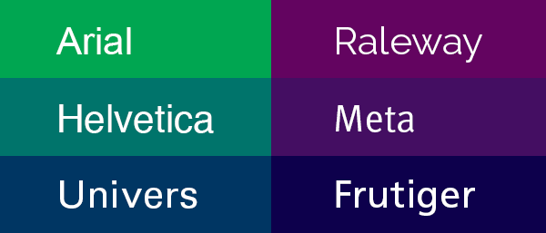
Arial
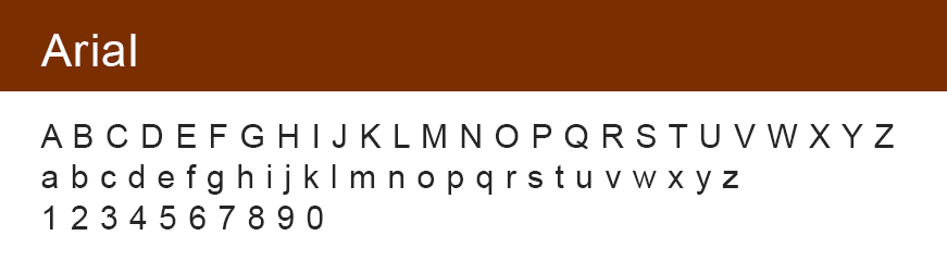
If you want to make sure your customers understand every word on your menu, Arial is always a safe bet. This clean sans serif font is available in narrow, bold, or classic lettering, and it will never distract from the main attraction: the food and drinks. Large Arial letters will keep your no-fuss stand menus easy to read from across the table.
Helvetica
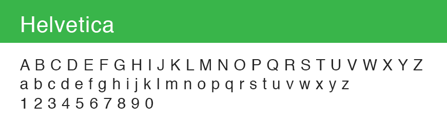
This timeless classic is a low-key and neutral option that is versatile enough for almost any type of restaurant. Helvetica is very similar to Arial, but a few key differences make it slightly more playful and pleasing to the eye. Letters like "t" and "a" have curved tails that simulate the flow of handwriting.
Baskerville
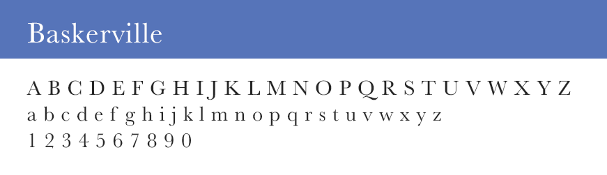
Do your customers sip craft cocktails under antique lamps? Baskerville is an old-school serif typeface that's the perfect for throwback menu items. Baskerville is sophisticated enough for formal menus in upscale restaurants, but not too fancy to clash with casual diners.
Our Top Menu Font Picks
So, which fonts are the most effective? We have a few typeface tips to help you narrow down your font options and truly flatter your menu options.
Sans Serif Fonts
Serif fonts have letters with "feet" on each end to help the eye flow from one letter to the next. However, people rarely read restaurant menus chronologically. Because your diners' eyes will be jumping around the page, stick to sans serif fonts such as Arial, rather than serif fonts such as Times New Roman.
Fun Fonts
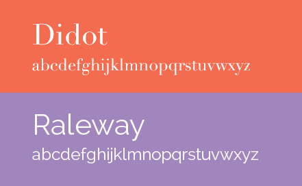
Your typeface offers one more opportunity to inject your unique personality into your menu. Play up your chic sensibilities with fashionable Didot, or make an eco-friendly statement with Raleway on recycled paper menus.
Different Numeral Fonts
Your letters and numbers must be complementary and easy to read. If your favorite letters come with tiny, oversized, or hard-to-read numerals, use a different font for the prices and other numbers on your menu. Just make sure you borrow your numbers from a font family with a similar size, width, and style.
Find The Right Font For Your Menu
Restaurant professionals know that the devil is in the detail. Selecting just the right menu font for your restaurant is a great way to reflect your brand and contribute to an unforgettable dining experience. After you've chosen the perfect font, don�t forget to present your menu with a flattering cover to protect your menu and keep every single letter legible and influential.
Categories
Recent Posts
- Why Re-Branding Your Restaurant Is The Key to Providing a Better Customer Experience
- The Ultimate Guide To Restaurant Menu Fonts
- The Top Resources To Help You Design Your Own Menu
- Crafting The Perfect Wine List
- 5 Restaurant Blogs That Will Help You Make More Money In 2016
- Are Secret Menu's The Secret Sauce To Avid Fans
- Infographic - Reasons For Keeping The Tipping System
- Why Tipping Is Better For Diners And Servers
- How To Manage Your Online Reviews: The Good And The Bad
- Next Level Restaurant Branding Featuring Nice Branding Agency
- The Start To Finish Guide To Creating Your Own Menu
- 10 Restaurants Really Cooking With Facebook Marketing
- 6 Things You Can Do Today To Boost Your Restaurants Brand
- 8 Menu Types You Should Know About
- Next Level Restaurant Branding Featuring: Vigor
- Are Restaurant Loyalty Programs Worth It?
- 7 Restaurants Doing Dining Differently
- Judging a Restaurant By Its Menu
- Three Major Tips for Effective Restaurant Management
- 6 Tips to Get More People into Your Restaurant